
iTunes Challenge: Let’s Rip and Tear!
Hi Friends! It’s Trace (tracermajig) here with you for this month’s iTunes challenge. This is my first time hosting the challenge and I have to say, the inspiration out there is endless!
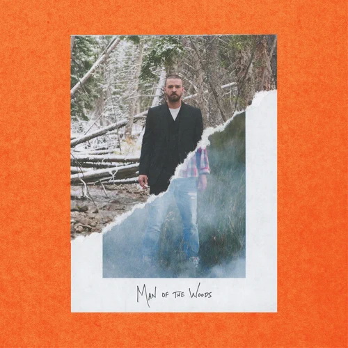
I don’t know about you but I love all of the torn and distressed products that Katie has in the store. I was looking back through my gallery and most of my pages have some kind of torn or distressed edge or paper on them. When I was scrolling through my playlists and saw this album cover, I knew we had to use it this month!
There are a lot of different ways you could use this cover as inspiration to create a page. My immediate thought is to use it to create a comparison page.
- Before/after
- Change of seasons
- First/last day of school
- Morning/night
- Work/play
- Growth and change (your garden, city, home etc)
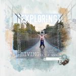
It would also be a great way to use two contrasting patterned papers on a layout. You could ‘tear’ the whole page in half or create a background layer of two different papers. You could also tuck your photos in along the edge like in this awesome template from Katie.
I love how our creative team created three entirely different looks!
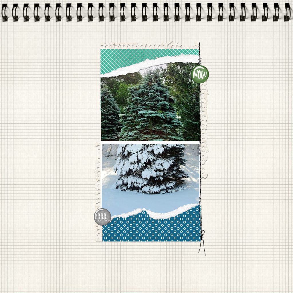
Linda (earlofoxford) was able to make her torn photo take centre stage by duplicating it and using a less saturated version in the background. That is a great technique to use if you want to give focus to one specific part of your photo.
Linda used these products on her page: Canvas Cardstocks Paper Pack 03, Canvas Cardstocks Paper Pack 10, Watery Foliage 34, Curved Page Masks 01, Curved Page Masks 02, Classic Cardstock: Dragon Trainer, Lifted Leaves 01, Blue Skies Element Pack, Cameron Element Pack, Cold Outside Element Pack, Darling Baby Element Pack, Farmhouse Garden Element Pack, Frosted Fun Element Pack, I Do Wedding Elements Pack,
Minted Christmas Element Pack, Leather Flowerettes, Powder Mountain Element Pack, Watercolor Sketchbook 01 Element Pack, Arctic Frost Element Pack, Drop Shadow Styles 02
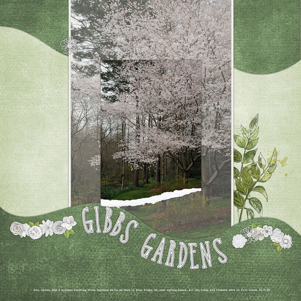
Lori Ann’s (lmaggs) page is a great example of using the torn look to create a comparison. It’s the same subject during two different seasons and gives such a wonderful contrast. I also like how she used the torn edges at the top and bottom of the photo so you didn’t miss a thing in the middle.
Lori Ann used these products to get this look: Bound Paper Pack 20, Cold Outside Scrapbooking Kit, Pocket Cards: Notebook 01, Torn Templates 01, Torn Classic White Photo Frames 04, Stamped Stiches Brushes and Stamps 09
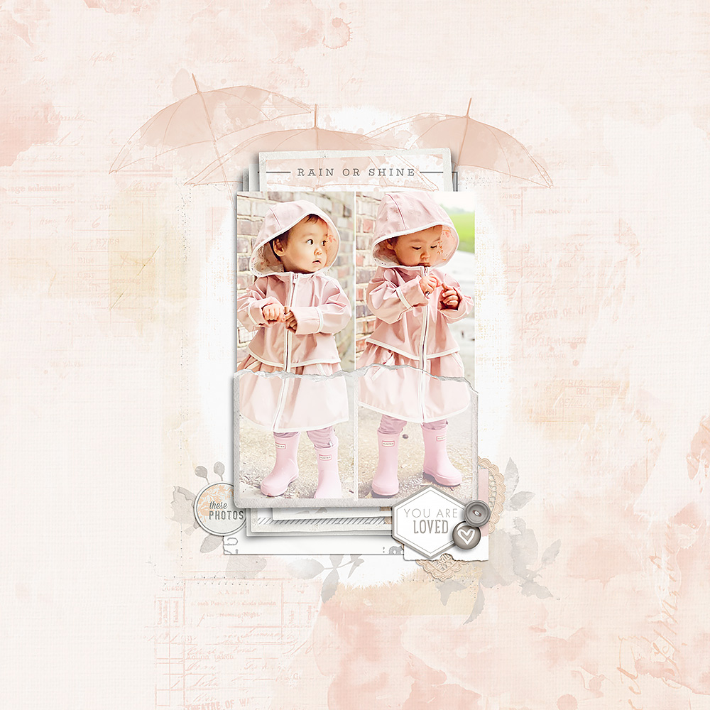
Amy (Amy L) created such a beautiful and delicate page using this technique. She still focused on a comparison (rain or shine) and used two photos but created an entirely different look by using the torn elements to create a pocket. The muted effect the pocket creates on the bottom of the photos gives such a lovely, soft contrast.
Amy used these products on her page: All Around 4×6 Borders Brushes and Stamps 06, April Showers 02, Cambrianna Element Pack, Cambrianna Solids Paper Pack, Fresh Vintage: Albia Element Pack, Fringed Photo Masks 04, Hexawords Brushes and Stamps 07, Ripped Vintage Photo Frames 04, Vintage Artistry Coral Paper Pack, Watercolor Sketchbook 01 Element Pack, Watery Branches Brushes and Stamps 01
I can’t wait to see where the inspiration takes you! Katie has generously provided a freebie to get you started. Don’t forget to share your page in the iTunes Inspiration Gallery and update the July Challenge Participation thread to earn store rewards!

Follow Us