
Get Inspired Challenge – Book Covers: April
Good morning everyone! Sharon here with a new Book Cover challenge.
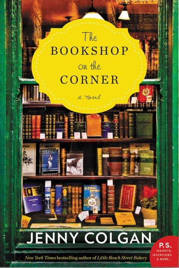
I’m not really one for the “Chick Lit” genre – but you know how a title can really suck you in? Well . . . how could you go past a book entitled, “The Bookshop on the Corner”? I couldn’t and I have to admit to rather enjoying the read.

There are a few things to love about this cover:
- The green and gold colour scheme – quite nice if you’re an
 Oi, Oi, Oi!
 - The “inside the window” effect – There are windows included in many Ephemera packs like these,
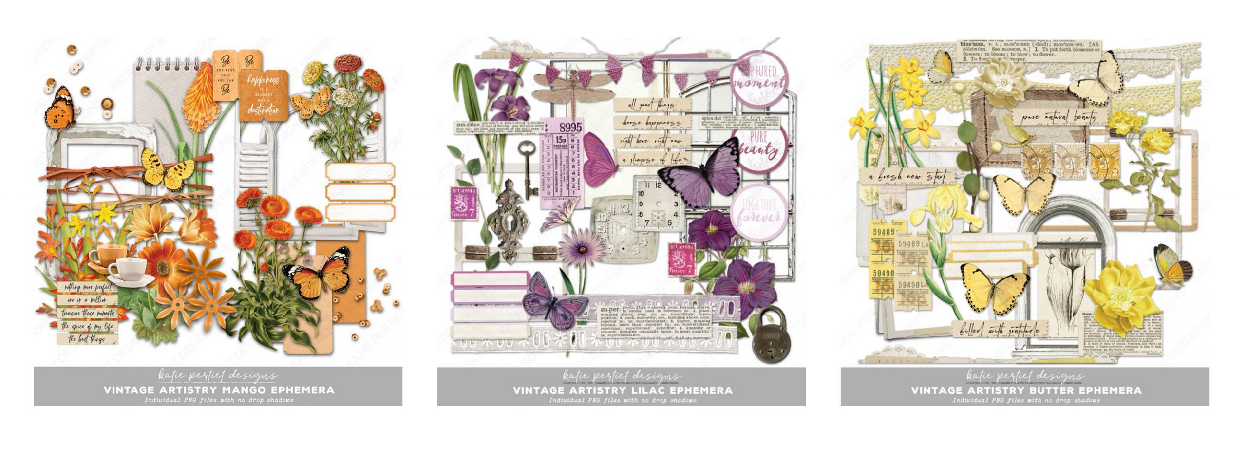 as well as Wood Veneer Frames, Mixed Media Frames Painted Window Frames and Readymade Frame Clusters. I love the feel of peeking inside a room , but of course you don’t have to stick to an inside theme. Any scene indoors or outdoors can be viewed through a window!
 - Using a Journalling Label as a place for your Title – almost every Kit in the store includes some of these.
- How cute is that title? This idea could work for any shopping related story. “The Dress Shop on Main Street”, “The Cafe on the Corner”, “The Bakery on the High Street”. You get the idea . . . what’s YOUR favourite place to shop or even to window shop?
- You might just stick with the books/reading theme.
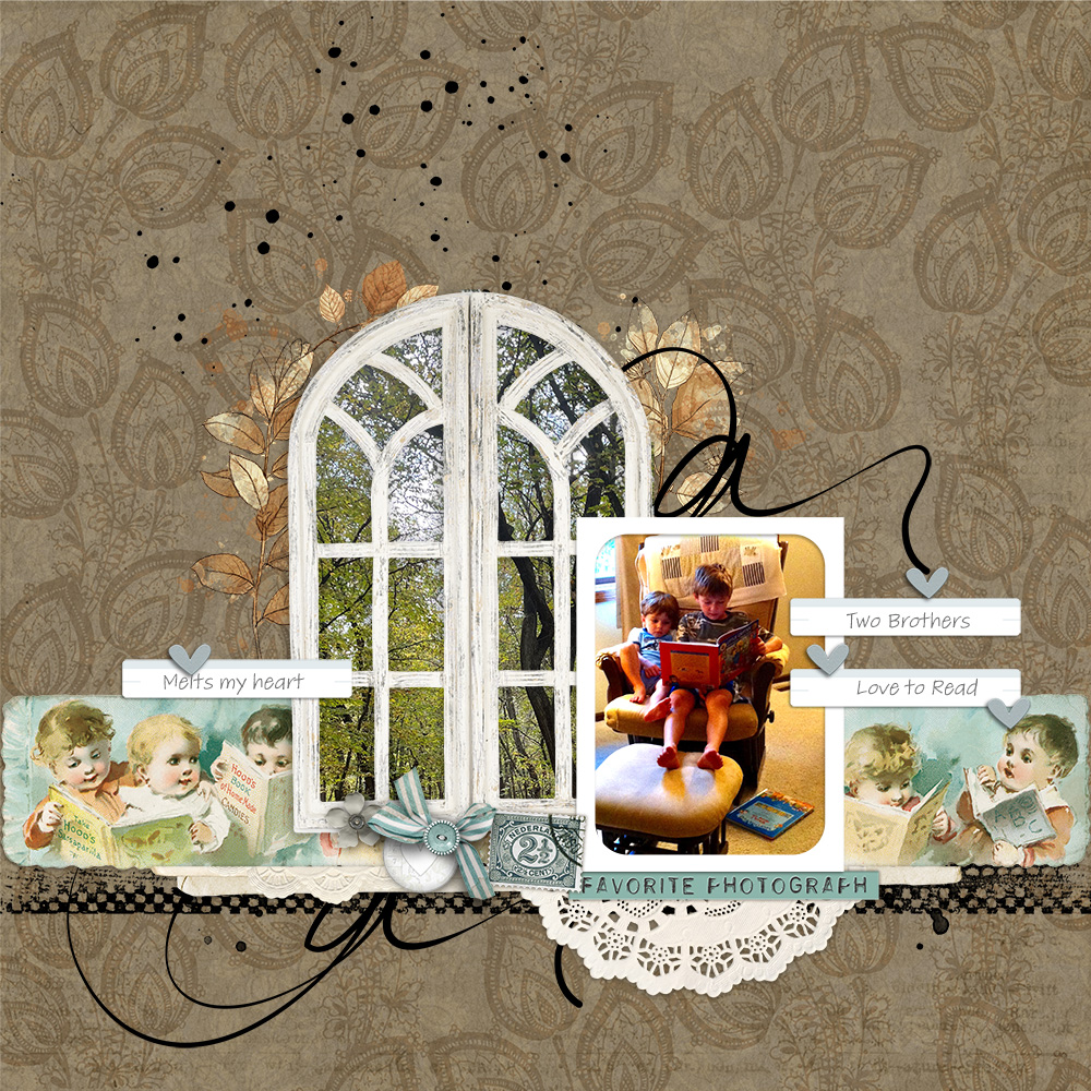
Merrilee (digigrandma) was inspired to scrap a treasured photo of her grandsons reading. Her use of the window to frame the scene outdoors tucked just behind the photo of her boys creates a very cozy feel which Merr has accentuated with the use of elements and colour – gorgeous!
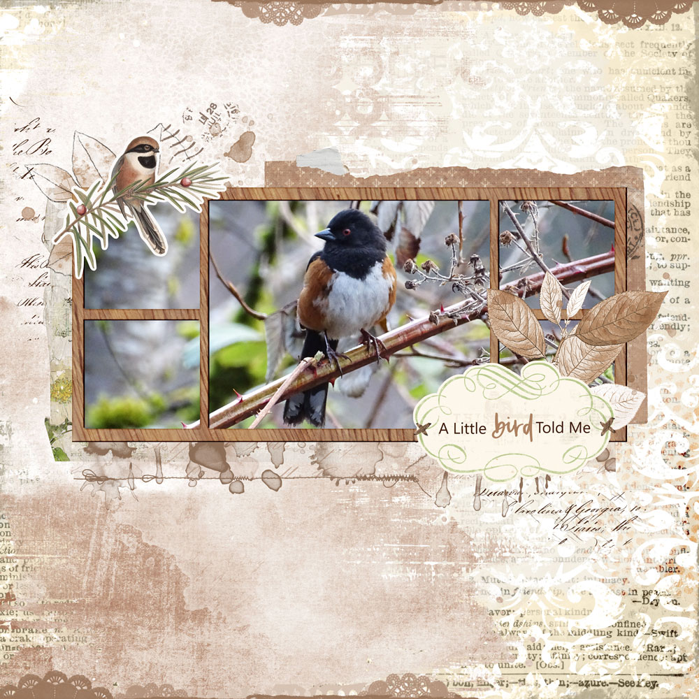
Shannon (shannonroller) has moved away from the reading theme, but has used the “view through the window” idea to scrap this lovely little feathered friend. She has used a cute title on a journalling label just like the cover designer did. A beautiful page for a stunning photo!
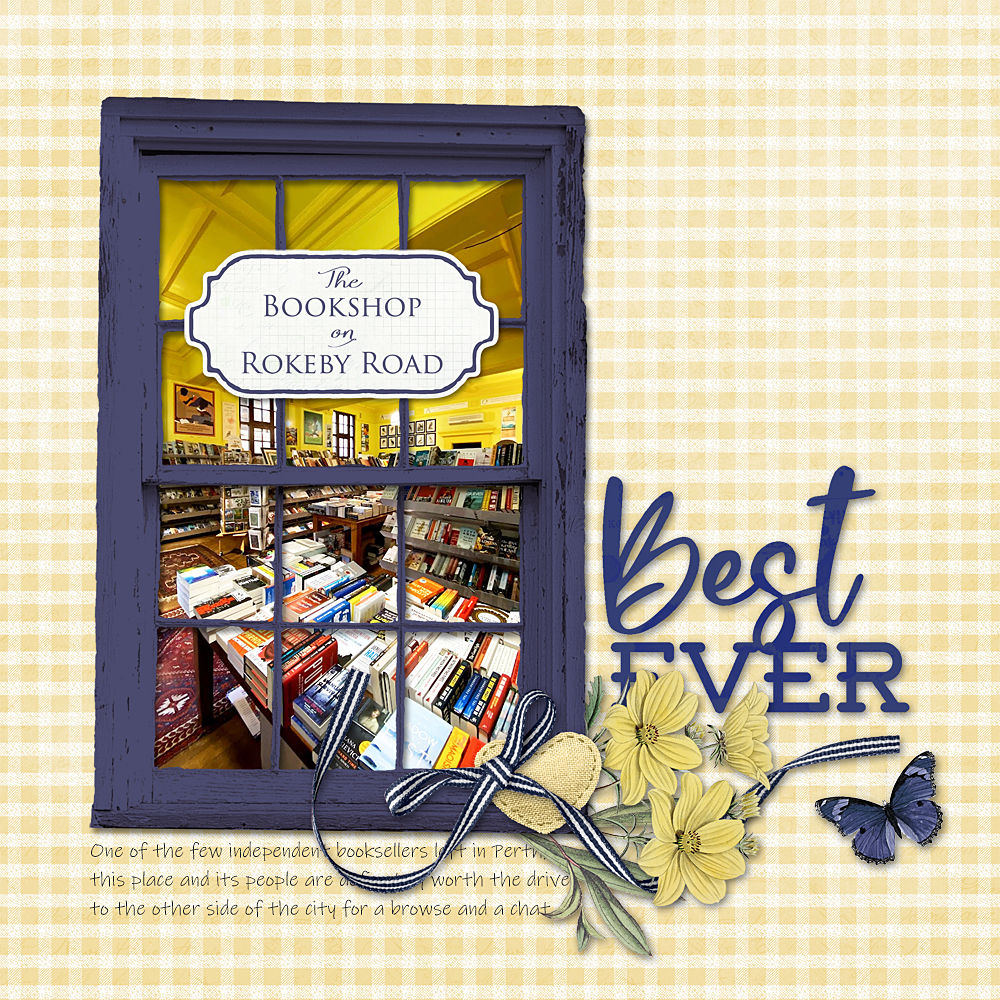
When I first saw the book cover I immediately thought of my favourite bookshop and decided to replicate the book cover, reducing the size though so that it didn’t fill my page, giving me room to add a cluster and some wordart. My bookshop has blue painted windows. I used the white wooden frame from the Vintage Artistry Tranquility Ephemera Pack and clipped a solid colour to it. I changed the blend mode on the solid colour layer to ‘multiply’ to allow the texture and the detail to show through. I modelled my title on the book title.
Why limit yourself to bookshops though. One of my favourite shops to browse in is a small gift store just down the road from the bookshop. This time, rather than replicating the cover I used some windows from the ARToptions Alena Ephemera Pack to help describe the “feel” of this store.

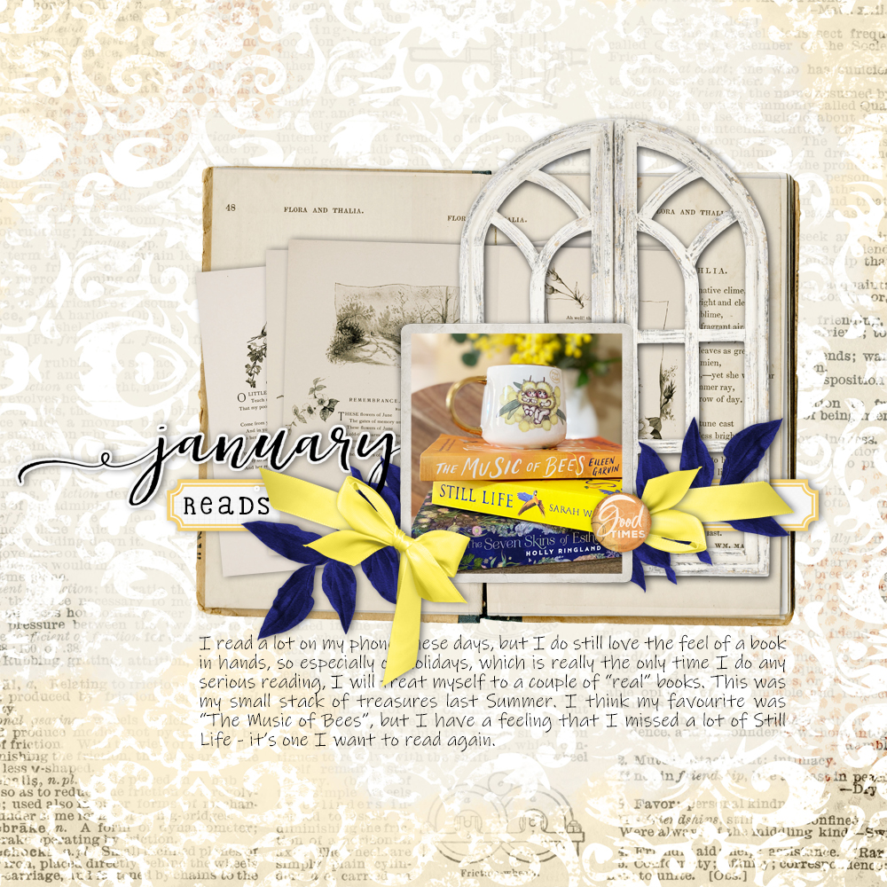
Lastly, I wanted to document the reading I did in January – the Summer holidays is my main reading time of the year. The background paper on these two layouts (note the differing opacity on these pages), and the window frame on the “January Reads” page are both included in the FREEBIE Katie has put together for us.
I do hope you can join us to document your favourite store, your reading habits or anything else you might spy through a window. Our layouts, with complete credit lists, will be in the Get Inspired Gallery where I hope we get to see your page this month.
Don’t forget to add your page made with 100% KPD products to the April Challenge Participation Sign in Thread to earn store rewards.
Happy scrapping everyone!
Follow Us