Color Challenge April: Color Picking Tools
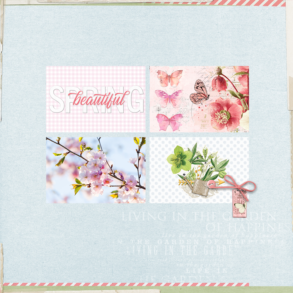
We are doing something a little different for the April Color Challenge!
There are several threads on the topic of color in the KPD forum and they are so fun to go back and read. I am not a designer so I find it really helpful to read about basic color theory and look at the color tools on Canva. Going through this information reminds me about color harmony and how the balance of color can create an inner sense of order. I find that I’m drawn to some pages in the gallery really that stand out because they have such great colour balance.
Here are a few formulas for achieving color harmony.
- Analogous: Any three colors which are side by side on a 12-part color wheel, such as yellow-green, yellow, and yellow-orange.
- Monochromatic: Three shades, tones and tints of one base color.
- Complementary: Two colors which are directly opposite each other, such as red and green and red-purple and yellow-green.
I also love using tools that help us pick colors from a photograph because sometimes I look at a photo, and need some color inspiration for a layout. I usually rely on the the Adobe Color Picker, but there are others out there as well such as Canva. I also get a lot of inspiration from scrolling through the eye-candy found on the Design Seeds website and Pinterest!
I love the Adobe Color Picker because it creates a palette for me that can be exported to Photoshop as a “Swatch”. Here is my process for picking colours from a photograph.
First I upload a photo to the “Extract theme” tab in the Adobe Color Picker. You can select your Color Mood on the left.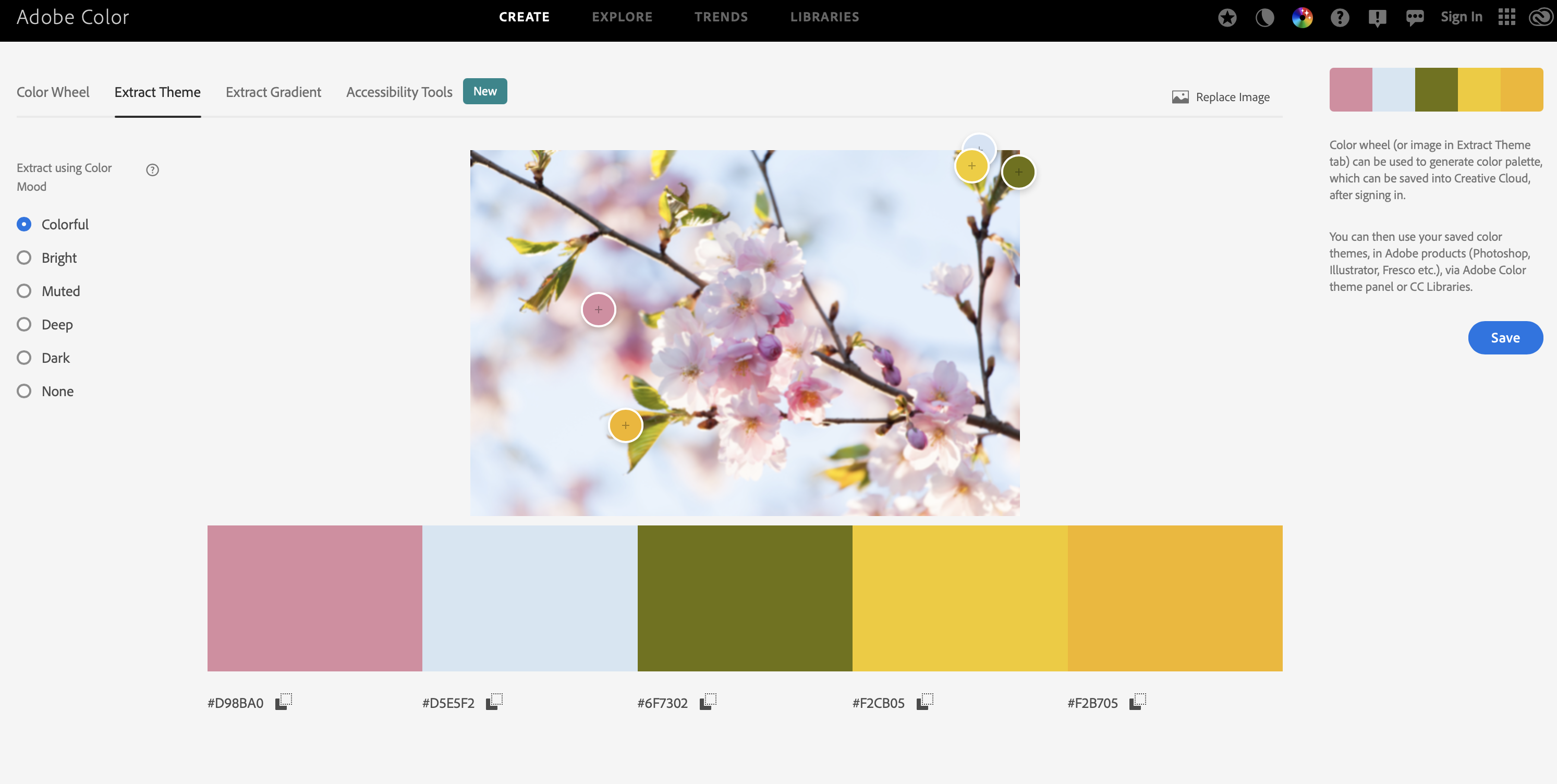
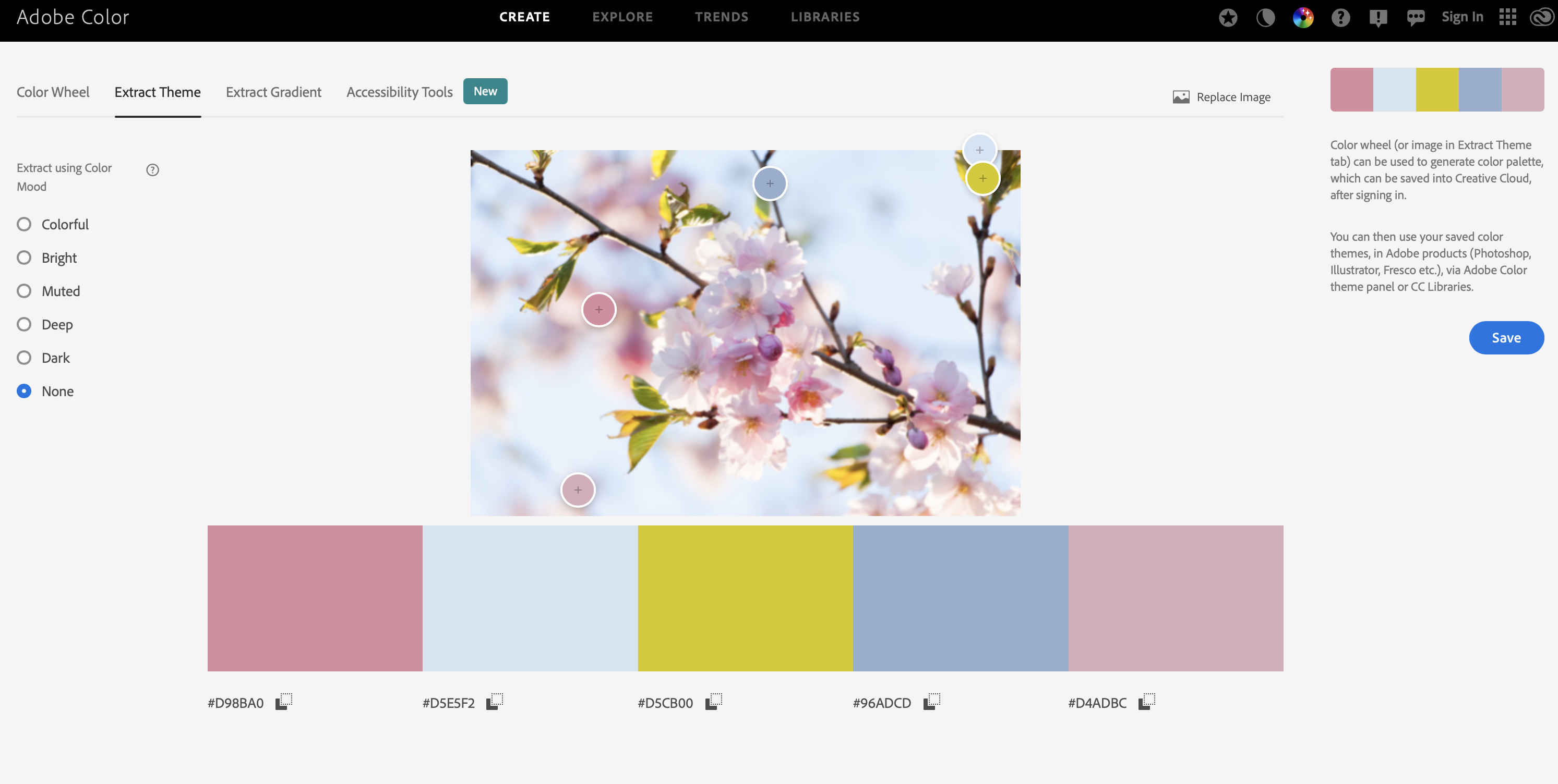
If I want to adjust the palette even further, I can move the selector buttons to other parts of the photo as you can see in the screen capture below, I’ve chosen different selection points which creates a new palette.
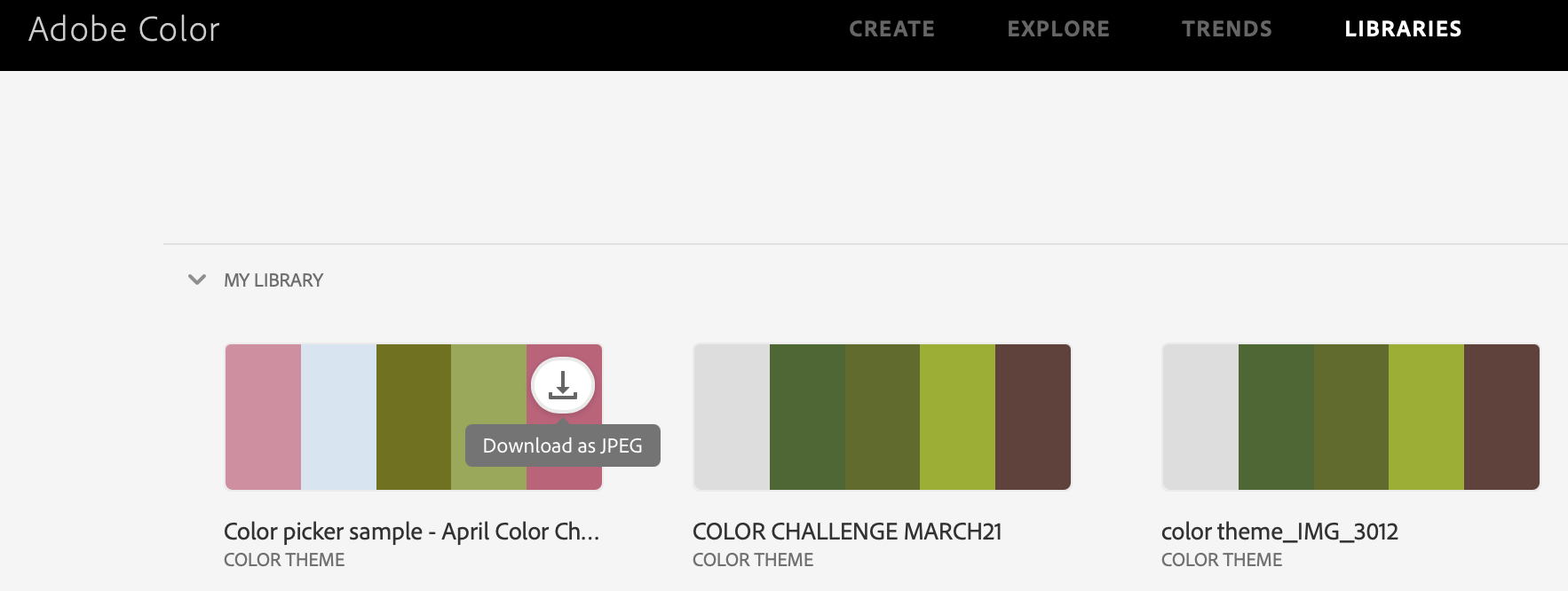
If you are signed in to your Adobe account, you will be able to save your palette to your library. When you go to the library, you can select to download the swatch as an ASE file.
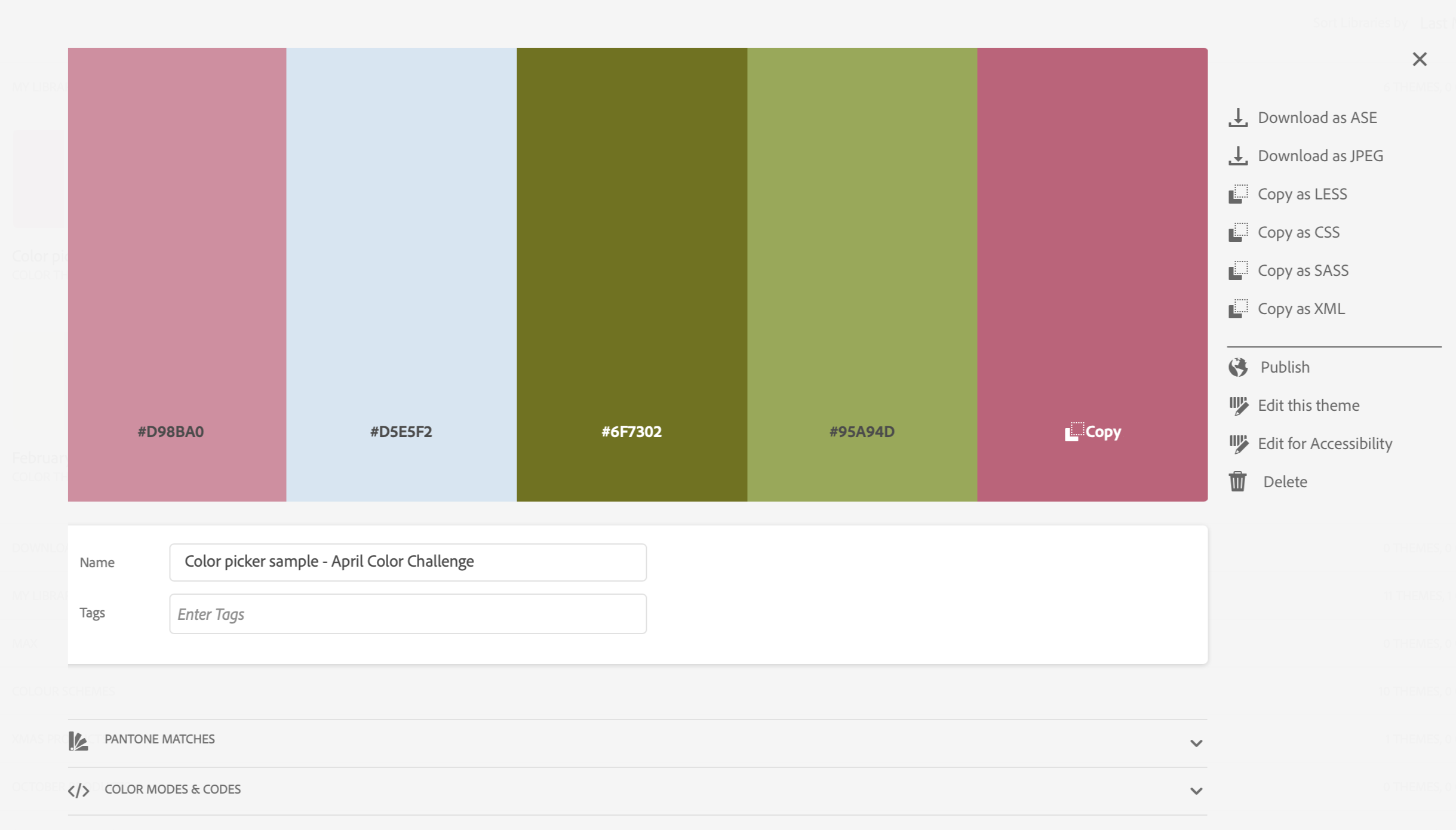
Then pop into Photoshop and open your “Swatches” window. Select “Import Swatches” from the drop down menu selector (top right).
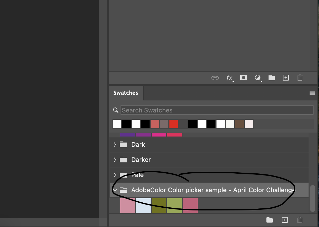
From there, I usually start browsing the store to find matching papers and elements. Sometimes, I have to slightly adjust the color of the products, but THAT is a whole other post!
Here is the page that I created with my swatch from the photo.

Products used: Watery Typecast Sentiments Brushes and Stamps 10 (coming soon), White Chipboard Alpha No.02 (coming soon), Cottage Fields Bits and Pieces, Cottage Fields Blendable Layers , Cottage Fields Chipboard Stickers, Cottage Fields Element Pack, Cottage Fields Paper Pack 01, Farmhouse Garden Solids Paper Pack, Misty Meadows Paper Pack, Palette Textures Paper Pack 27, Taped Together Overlays 04, Vintage Botanicals Printable Washi Tape Strips
So there you have it! For this month’s Color Challenge, instead of selecting a specific palette, I am challenging you to use a Color Picker tool to find inspiration for a layout that shows spring where you are in the world! You might surprise yourself and use colors that you don’t often use!
Remember to use all DD products on your page, post your finished layout in the Color Challenge Gallery, and post in the April Challenge Thread to qualify for great discounts in the store! I can’t wait to see what colors inspire your pages for April!



Follow Us